About
The idea
For this project, I first conducted research into
the message and purpose the website aims
to communicate to its customers. Based on this
research, I developed a visual direction that
aligns with the brand identity. The color palette
was inspired by the icon of Brussels, with blue
and yellow as the mandatory primary colors
throughout the design.
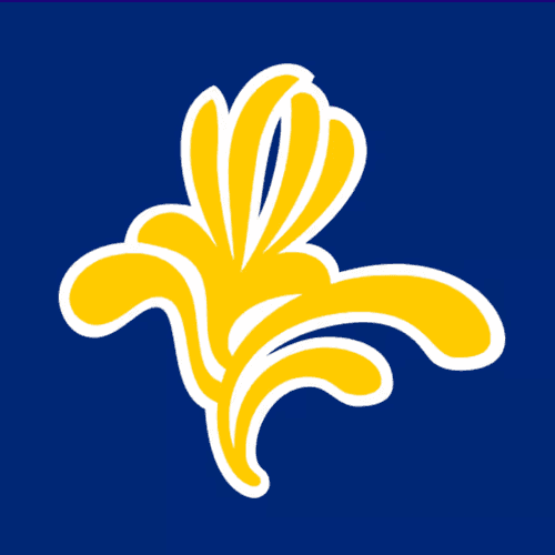
For the banner design, I used the current Brussels
icon as a background element to strengthen the
connection with the city’s identity. I developed both
a blue and a yellow variation, as these colors were
chosen to become the primary visual colors of the
website.
Banner design
The Logo
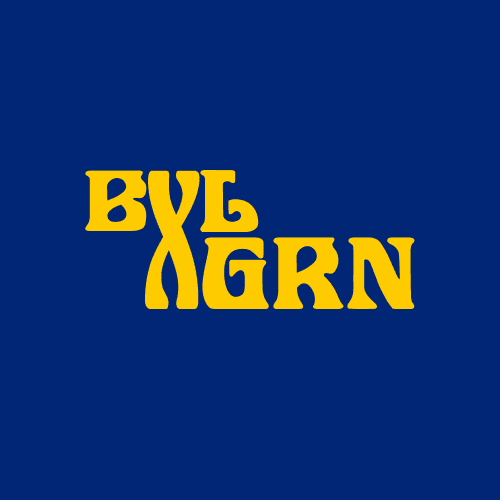
For the logo design, I wanted to combine
elements of both Brussels and Groningen
into a single concept. I experimented by
merging the letters BXL (Brussels) with GRN
(Groningen). However, in the end, I felt that
the result represented “Groningen meets Brussels”
more than “Brussels meets Groningen,” which did
not fully match the intended concept.
Logo
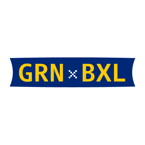
Eventually, I decided to simplify the design and came
up with an idea that could be consistently used
throughout the brand identity. During this process,
I experimented with a pixel-style X, which ultimately
became the final logo design.
Line up
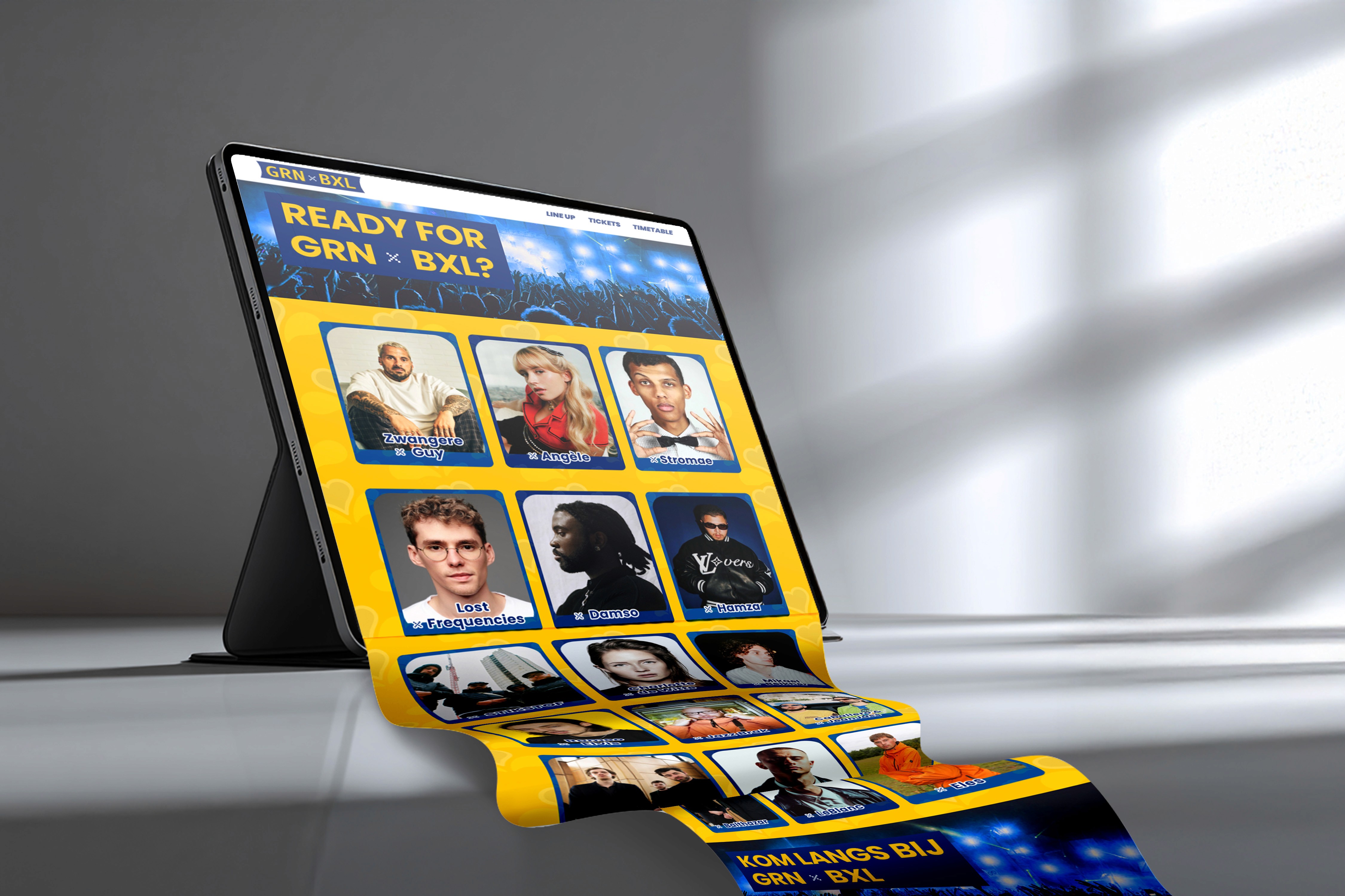
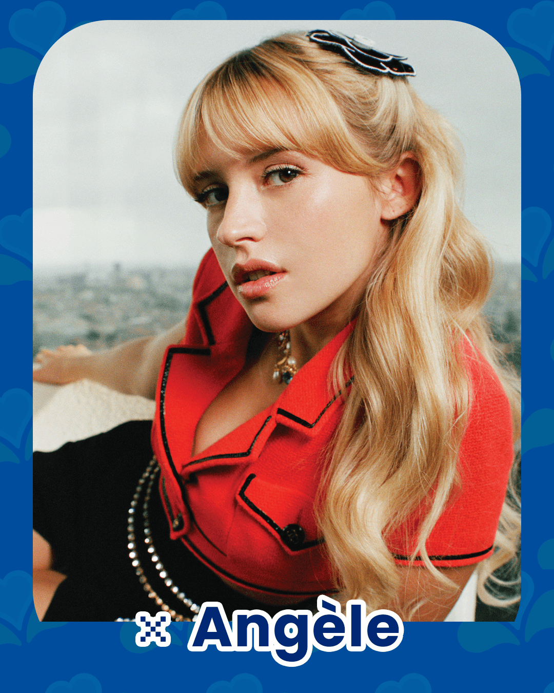
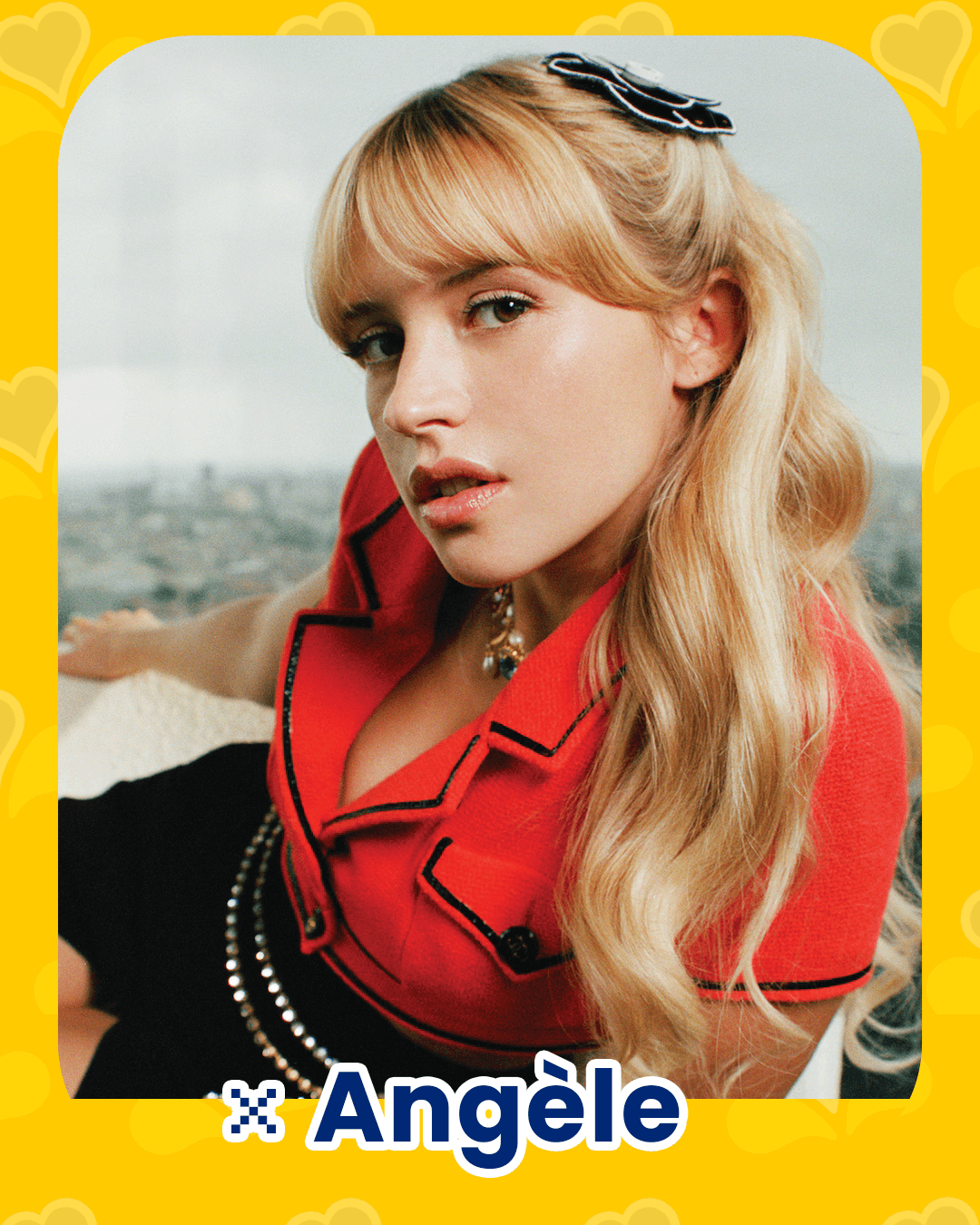
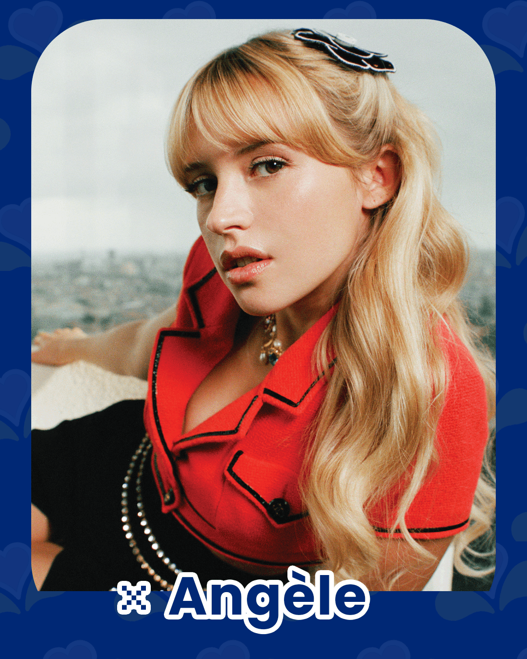
For the lineup section, I designed custom borders to showcase the artists.
In the final design, I chose to use the light bluevariations on the sides and
the dark blue version in the center to create visual balance and emphasis.
Timetable
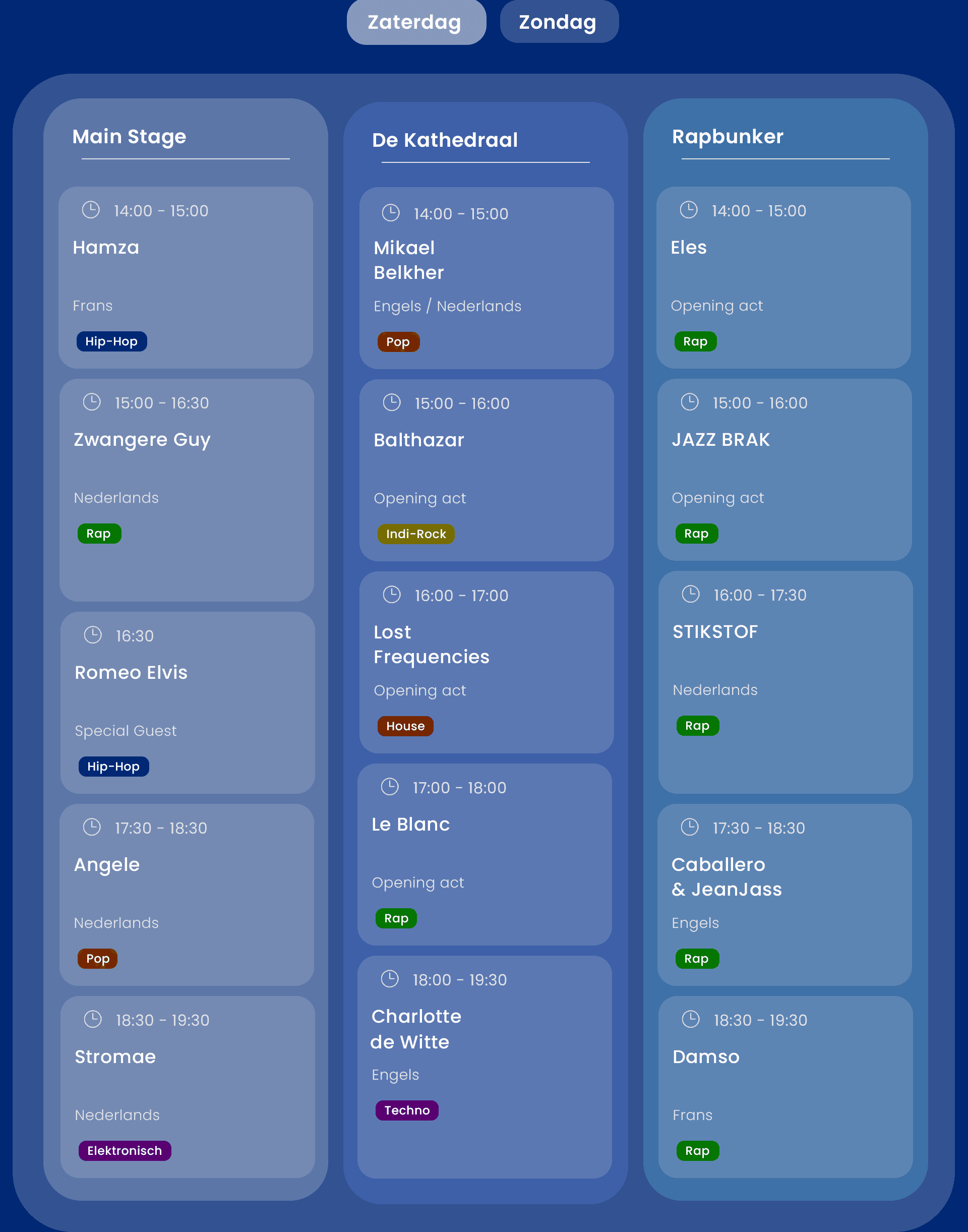
For the timetable, I designed a user-friendly
menu that made it easy to display schedules
for each stage and day. The music genres were
also clearly indicated, and when hovering over a
tile, it smoothly zooms in to create a more
interactive user experience.
Link to Figma
To view the complete project and see the final result,
you can click the button below.
Figma Link